Note
This tutorial was generated from a Jupyter notebook that can be accessed here.
Nonlinear regression
In this tutorial, we present the nonlinear regression utilities from the analysis module.
We import the necessary modules:
from PCAfold import preprocess
from PCAfold import reduction
from PCAfold import analysis
from PCAfold import reconstruction
import numpy as np
and we set some initial parameters:
save_filename = None
Generating a synthetic data set
We begin by generating a synthetic data set with two independent variables, \(x\) and \(y\), and one dependent variable, \(\phi\), that we will nonlinearly regress using kernel regression.
Generate independent variables \(x\) and \(y\) from a uniform grid:
n_points = 100
grid = np.linspace(0,100,n_points)
x, y = np.meshgrid(grid, grid)
x = x.flatten()
y = y.flatten()
xy = np.hstack((x[:,None],y[:,None]))
(n_observations, _) = np.shape(xy)
Generate a dependent variable \(\phi\) as a quadratic function of \(x\):
phi = xy[:,0:1]**2
Visualize the generated data set:
plt = reduction.plot_2d_manifold(x,
                                 y,
                                 color=phi,
                                 x_label='x',
                                 y_label='y',
                                 colorbar_label='$\phi$',
                                 color_map='inferno',
                                 figure_size=(8,4),
                                 save_filename=save_filename)

Kernel regression
We first generate train and test samples using the DataSampler class:
train_perc = 80
random_seed = 100

idx = np.zeros((n_observations,)).astype(int)
sample_random = preprocess.DataSampler(idx, random_seed=random_seed, verbose=False)
(idx_train, idx_test) = sample_random.random(train_perc, test_selection_option=1)

xy_train = xy[idx_train,:]
xy_test = xy[idx_test,:]

phi_train = phi[idx_train]
phi_test = phi[idx_test]
Specify the bandwidth for the Nadaraya-Watson kernel:
bandwidth = 10
Fit the kernel regression model with train data:
model = analysis.KReg(xy_train, phi_train)
Predict the test data:
phi_test_predicted = model.predict(xy_test, bandwidth=bandwidth)
Predict all data:
phi_predicted = model.predict(xy, bandwidth=bandwidth)
Nonlinear regression assessment
In this section we will perform few assessments of the quality of the nonlinear regression.
Visual assessment
We begin by visualizing the regressed (predicted) dependent variable \(\phi\). This can be done either in 2D:
plt = reconstruction.plot_2d_regression(x,
                                  phi,
                                  phi_predicted,
                                  x_label='$x$',
                                  y_label='$\phi$',
                                  figure_size=(10,4),
                                  save_filename=save_filename)

or in 3D:
plt = reconstruction.plot_3d_regression(x,
                                  y,
                                  phi,
                                  phi_predicted,
                                  elev=20,
                                  azim=-100,
                                  x_label='$x$',
                                  y_label='$y$',
                                  z_label='$\phi$',
                                  figure_size=(10,7),
                                  save_filename=save_filename)

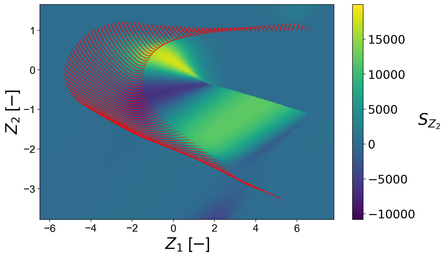
Predicted 2D field for scalar quantities
When the predicted variable is a scalar quantity, a scatter plot for the regressed scalar field can be plotted using the function plot_2d_regression_scalar_field. Regression of the scalar field can be tested at any user-defined grid, also outside of the bounds of the training data. This can be of particular importance when generating reduced-order models, where the behavior of the regression should be tested outside of the training manifold.
Below, we show an example on a combustion data set.
X = np.genfromtxt('data-state-space.csv', delimiter=',')
S_X = np.genfromtxt('data-state-space-sources.csv', delimiter=',')
pca_X = reduction.PCA(X, scaling='vast', n_components=2)
PCs = pca_X.transform(X)
PC_sources = pca_X.transform(S_X, nocenter=True)
(PCs_pp, centers_PCs, scales_PCs) = preprocess.center_scale(PCs, '-1to1')
Fit the kernel regression model with the train data:
KReg_model = analysis.KReg(PCs_pp, PC_sources)
We define the regression model function that will make predictions for any query point:
def regression_model(regression_input):

    regression_input_CS = (regression_input - centers_PCs)/scales_PCs

    regressed_value = KReg_model.predict(regression_input_CS, 'nearest_neighbors_isotropic', n_neighbors=10)[0,1]

    return regressed_value
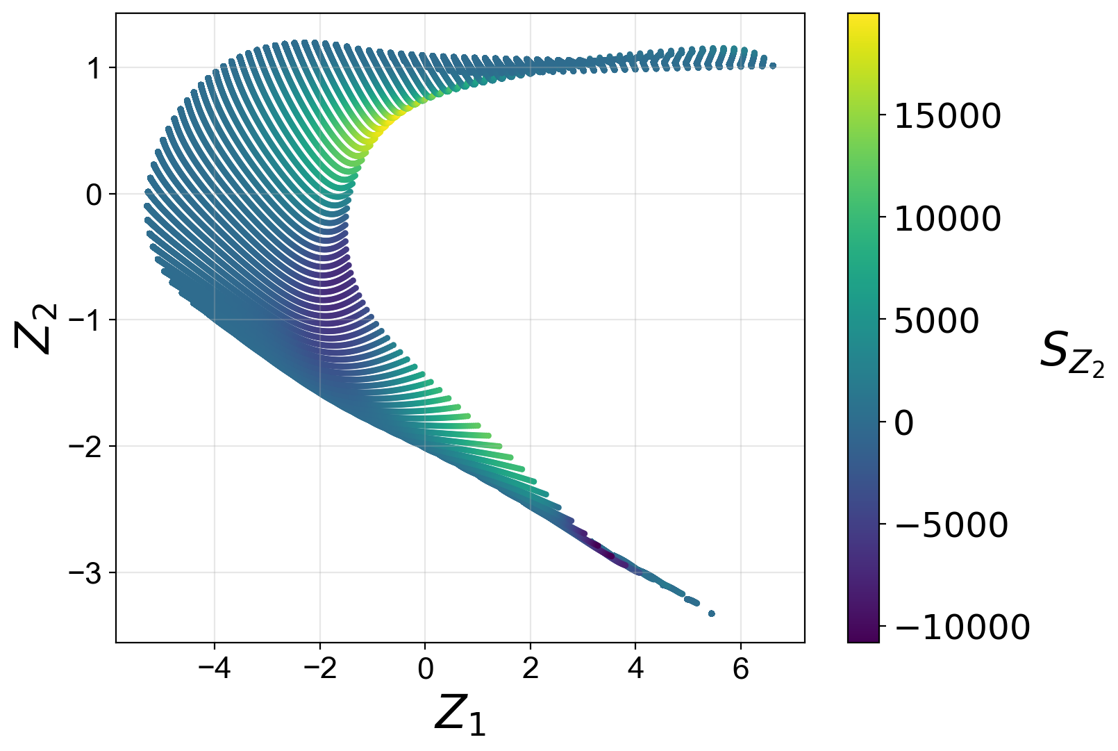
We first visualize the training manifold, colored by the dependent variable being predicted:
reduction.plot_2d_manifold(PCs[:,0],
                           PCs[:,1],
                           x_label='$Z_1$',
                           y_label='$Z_2$',
                           color=PC_sources[:,1],
                           color_map='viridis',
                           colorbar_label='$S_{Z_2}$',
                           figure_size=(8,6),
                           save_filename=save_filename)
Define the bounds for the scalar field:
grid_bounds = ([np.min(PCs[:,0]),np.max(PCs[:,0])],[np.min(PCs[:,1]),np.max(PCs[:,1])])
Plot the regressed scalar field:
plt = reconstruction.plot_2d_regression_scalar_field(grid_bounds,
                                               regression_model,
                                               x=PCs[:,0],
                                               y=PCs[:,1],
                                               resolution=(200,200),
                                               extension=(10,10),
                                               s_field=10,
                                               s_manifold=1,
                                               x_label='$Z_1$ [$-$]',
                                               y_label='$Z_2$ [$-$]',
                                               manifold_color='r',
                                               colorbar_label='$S_{Z, 1}$',
                                               color_map='viridis',
                                               colorbar_range=(np.min(PC_sources[:,1]), np.max(PC_sources[:,1])),
                                               manifold_alpha=1,
                                               grid_on=False,
                                               figure_size=(10,6),
                                               save_filename=save_filename);
Streamplots for predicted vector quantities
In a special case, when the predicted variable is a vector, a streamplot of the regressed vector field can be plotted using the function plot_2d_regression_streamplot. Regression of a vector field can be tested at any user-defined grid, also outside of the bounds of the training data. This can be of particular importance when generating reduced-order models, where the behavior of the regression should be tested outside of the training manifold.
Below, we show an example on a synthetic data set:
X = np.random.rand(100,5)
S_X = np.random.rand(100,5)

pca_X = reduction.PCA(X, n_components=2)
PCs = pca_X.transform(X)
S_Z = pca_X.transform(S_X, nocenter=True)

vector_model = analysis.KReg(PCs, S_Z)
We define the regression model function that will make predictions for any query point:
def regression_model(query):

    predicted = vector_model.predict(query, 'nearest_neighbors_isotropic', n_neighbors=1)

    return predicted
Define the bounds for the streamplot:
grid_bounds = ([np.min(PCs[:,0]),np.max(PCs[:,0])],[np.min(PCs[:,1]),np.max(PCs[:,1])])
Plot the regression streamplot:
plt = reconstruction.plot_2d_regression_streamplot(grid_bounds,
                                    regression_model,
                                    x=PCs[:,0],
                                    y=PCs[:,1],
                                    resolution=(15,15),
                                    extension=(20,20),
                                    color='k',
                                    x_label='$Z_1$',
                                    y_label='$Z_2$',
                                    manifold_color=X[:,0],
                                    colorbar_label='$X_1$',
                                    color_map='plasma',
                                    colorbar_range=(0,1),
                                    manifold_alpha=1,
                                    grid_on=False,
                                    figure_size=(10,6),
                                    title='Streamplot',
                                    save_filename=None)

Error metrics
Several error metrics are available that will measure how well the dependent variable(s) were predicted. Metrics can be accessed individually and collectively. Below, we will show examples of both. The available metrics are:
Mean absolute error
Mean squared error
Root mean squared error
Normalized root mean squared error
Turning points
Good estimate
Good direction estimate
An example of computing mean absolute error is shown below:
MAE = reconstruction.mean_absolute_error(phi, phi_predicted)
We also compute the coefficient of determination, \(R^2\), values for the test data and entire data:
r2_test = reconstruction.coefficient_of_determination(phi_test, phi_test_predicted)
r2_all = reconstruction.coefficient_of_determination(phi, phi_predicted)

print('All R2:\t\t' + str(round(r2_all, 6)) + '\nTest R2:\t' + str(round(r2_test, 6)))
The code above will print:
All R2:       0.997378
Test R2:      0.997366
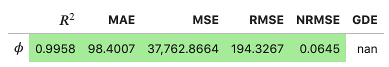
By instantiating an object of the RegressionAssessment class, one can compute all available metrics at once:
regression_metrics = reconstruction.RegressionAssessment(phi, phi_predicted, variable_names=['$\phi$'], norm='std')
As an example, mean absolute error can be accessed by:
regression_metrics.mean_absolute_error
All computed metrics can be printed with the use of the RegressionAssessment.print_metrics function. Few output formats are available.
Raw text format:
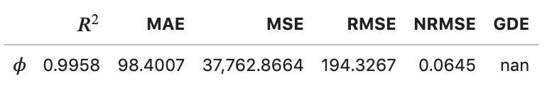
regression_metrics.print_metrics(table_format=['raw'], float_format='.4f')
--------------------
$\phi$
R2: 0.9958
MAE:        98.4007
MSE:        37762.8664
RMSE:       194.3267
NRMSE:      0.0645
GDE:        nan
tex format:
regression_metrics.print_metrics(table_format=['tex'], float_format='.4f')
\begin{table}[h!]
\begin{center}
\begin{tabular}{ll} \toprule
 & \textit{$\phi$} \\ \midrule
$R^2$ & 0.9958 \\
MAE & 98.4007 \\
MSE & 37762.8664 \\
RMSE & 194.3267 \\
NRMSE & 0.0645 \\
GDE & nan \\
\end{tabular}
\caption{}\label{}
\end{center}
\end{table}
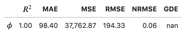
pandas.DataFrame format (most recommended for Jupyter notebooks):
regression_metrics.print_metrics(table_format=['pandas'], float_format='.4f')
Note that with the float_format parameter you can change the number of digits displayed:
regression_metrics.print_metrics(table_format=['pandas'], float_format='.2f')
Stratified error metrics
In addition to a single value of \(R^2\) for the entire data set, we can also compute stratified \(R^2\) values. This allows us to observe how kernel regression performed in each strata of the dependent variable \(\phi\). We will compute the stratified \(R^2\) in 20 bins of \(\phi\):
n_bins = 20
use_global_mean = False
verbose = True

(idx, bins_borders) = preprocess.variable_bins(phi, k=n_bins, verbose=False)

r2_in_bins = reconstruction.stratified_coefficient_of_determination(phi, phi_predicted, idx=idx, use_global_mean=use_global_mean, verbose=verbose)
The code above will print:
Bin 1       | size   2300   | R2    0.868336
Bin 2       | size   900    | R2    0.870357
Bin 3       | size   700    | R2    0.863821
Bin 4       | size   600    | R2    0.880655
Bin 5       | size   500    | R2    0.875764
Bin 6       | size   500    | R2    0.889148
Bin 7       | size   400    | R2    0.797888
Bin 8       | size   400    | R2    0.773907
Bin 9       | size   400    | R2    0.79479
Bin 10      | size   400    | R2    0.862069
Bin 11      | size   300    | R2    0.864022
Bin 12      | size   300    | R2    0.93599
Bin 13      | size   300    | R2    0.972185
Bin 14      | size   300    | R2    0.988894
Bin 15      | size   300    | R2    0.979975
Bin 16      | size   300    | R2    0.766598
Bin 17      | size   300    | R2    -0.46525
Bin 18      | size   200    | R2    -11.158072
Bin 19      | size   300    | R2    -10.94865
Bin 20      | size   300    | R2    -28.00655
We can plot the stratified \(R^2\) values across bins centers:
plt = reconstruction.plot_stratified_metric(r2_in_bins,
                                      bins_borders,
                                      variable_name='$\phi$',
                                      metric_name='$R^2$',
                                      yscale='linear',
                                      figure_size=(10,2),
                                      save_filename=save_filename)

This last plot lets us see that kernel regression performed very well in the middle range of the dependent variable values but very poorly at both edges of that range. This is consistent with what we have seen in a 3D plot that visualized the regression result.
All other regression metrics can also be computed in the data bins, similarly to the example shown for the stratified \(R^2\) values.
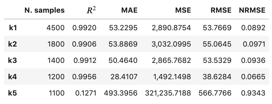
We will create five bins:
(idx, bins_borders) = preprocess.variable_bins(phi, k=5, verbose=False)

stratified_regression_metrics = reconstruction.RegressionAssessment(phi, phi_predicted, idx=idx, variable_names=['$\phi$'], norm='std')
All computed stratified metrics can be printed with the use of the RegressionAssessment.print_stratified_metrics function. Few output formats are available.
Raw text format:
stratified_regression_metrics.print_stratified_metrics(table_format=['raw'], float_format='.4f')
-------------------------
k1
N. samples: 4500
R2: 0.9920
MAE:        53.2295
MSE:        2890.8754
RMSE:       53.7669
NRMSE:      0.0892
-------------------------
k2
N. samples: 1800
R2: 0.9906
MAE:        53.8869
MSE:        3032.0995
RMSE:       55.0645
NRMSE:      0.0971
-------------------------
k3
N. samples: 1400
R2: 0.9912
MAE:        50.4640
MSE:        2865.7682
RMSE:       53.5329
NRMSE:      0.0936
-------------------------
k4
N. samples: 1200
R2: 0.9956
MAE:        28.4107
MSE:        1492.1498
RMSE:       38.6284
NRMSE:      0.0665
-------------------------
k5
N. samples: 1100
R2: 0.1271
MAE:        493.3956
MSE:        321235.7188
RMSE:       566.7766
NRMSE:      0.9343
tex format:
stratified_regression_metrics.print_stratified_metrics(table_format=['tex'], float_format='.4f')
\\begin{table}[h!]
\\begin{center}
\\begin{tabular}{llllll} \\toprule
 & \\textit{k1} & \\textit{k2} & \\textit{k3} & \\textit{k4} & \\textit{k5} \\\\ \\midrule
N. samples & 4500.0000 & 1800.0000 & 1400.0000 & 1200.0000 & 1100.0000 \\\\
$R^2$ & 0.9920 & 0.9906 & 0.9912 & 0.9956 & 0.1271 \\\\
MAE & 53.2295 & 53.8869 & 50.4640 & 28.4107 & 493.3956 \\\\
MSE & 2890.8754 & 3032.0995 & 2865.7682 & 1492.1498 & 321235.7188 \\\\
RMSE & 53.7669 & 55.0645 & 53.5329 & 38.6284 & 566.7766 \\\\
NRMSE & 0.0892 & 0.0971 & 0.0936 & 0.0665 & 0.9343 \\\\
\\end{tabular}
\\caption{}\\label{}
\\end{center}
\\end{table}
pandas.DataFrame format (most recommended for Jupyter notebooks):
stratified_regression_metrics.print_stratified_metrics(table_format=['pandas'], float_format='.4f')
Comparison of two regression solutions
Two object of the RegressionAssessment class can be compared when printing the metrics. This results in a color-coded comparison where worse results are colored red and better results are colored green.
Below, we generate a new regression solution that will be compared with the one obtained above. We will increase the bandwidth to get different regression metrics:
phi_predicted_comparison = model.predict(xy, bandwidth=bandwidth+2)
Comparison can be done for the global metrics, where each variable will be compared separately:
regression_metrics_comparison = reconstruction.RegressionAssessment(phi, phi_predicted_comparison, variable_names=['$\phi$'], norm='std')

regression_metrics.print_metrics(table_format=['pandas'], float_format='.4f', comparison=regression_metrics_comparison)
and for the stratified metrics, where each bin will be compared separately:
stratified_regression_metrics_comparison = reconstruction.RegressionAssessment(phi, phi_predicted_comparison, idx=idx)

stratified_regression_metrics.print_stratified_metrics(table_format=['raw'], float_format='.2f', comparison=stratified_regression_metrics_comparison)
-------------------------
k1
N. samples: 4500
R2: 0.99    BETTER
MAE:        53.23   BETTER
MSE:        2890.88 BETTER
RMSE:       53.77   BETTER
NRMSE:      0.09    BETTER
-------------------------
k2
N. samples: 1800
R2: 0.99    BETTER
MAE:        53.89   BETTER
MSE:        3032.10 BETTER
RMSE:       55.06   BETTER
NRMSE:      0.10    BETTER
-------------------------
k3
N. samples: 1400
R2: 0.99    BETTER
MAE:        50.46   BETTER
MSE:        2865.77 BETTER
RMSE:       53.53   BETTER
NRMSE:      0.09    BETTER
-------------------------
k4
N. samples: 1200
R2: 1.00    BETTER
MAE:        28.41   BETTER
MSE:        1492.15 BETTER
RMSE:       38.63   BETTER
NRMSE:      0.07    BETTER
-------------------------
k5
N. samples: 1100
R2: 0.13    BETTER
MAE:        493.40  BETTER
MSE:        321235.72       BETTER
RMSE:       566.78  BETTER
NRMSE:      0.93    BETTER